Fruiteao
Category: Brand Identity
Client: Fruiteao
With: Hierarchy Design Studio
Location: 113 McCaul St, Toronto, ON M5T 2X3
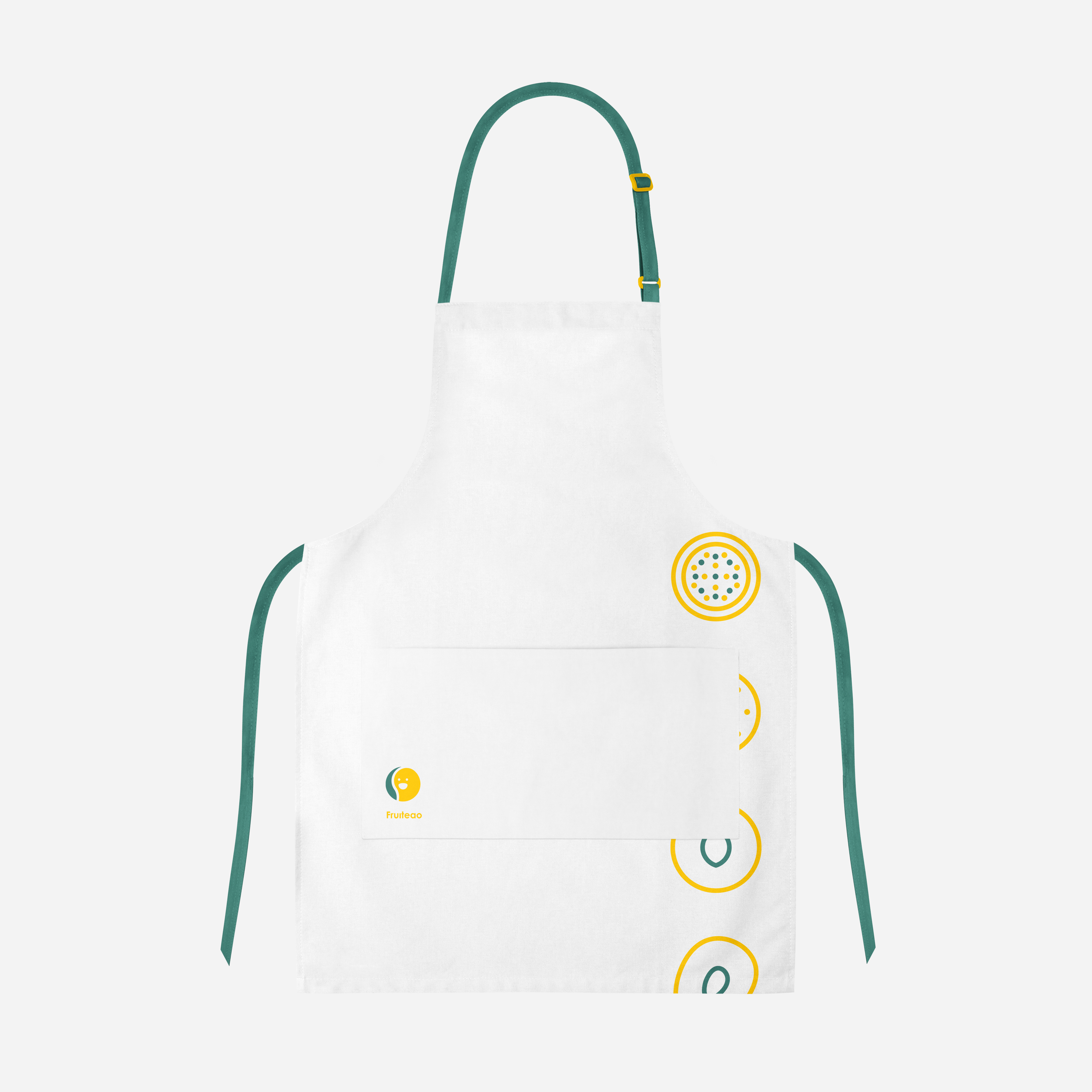
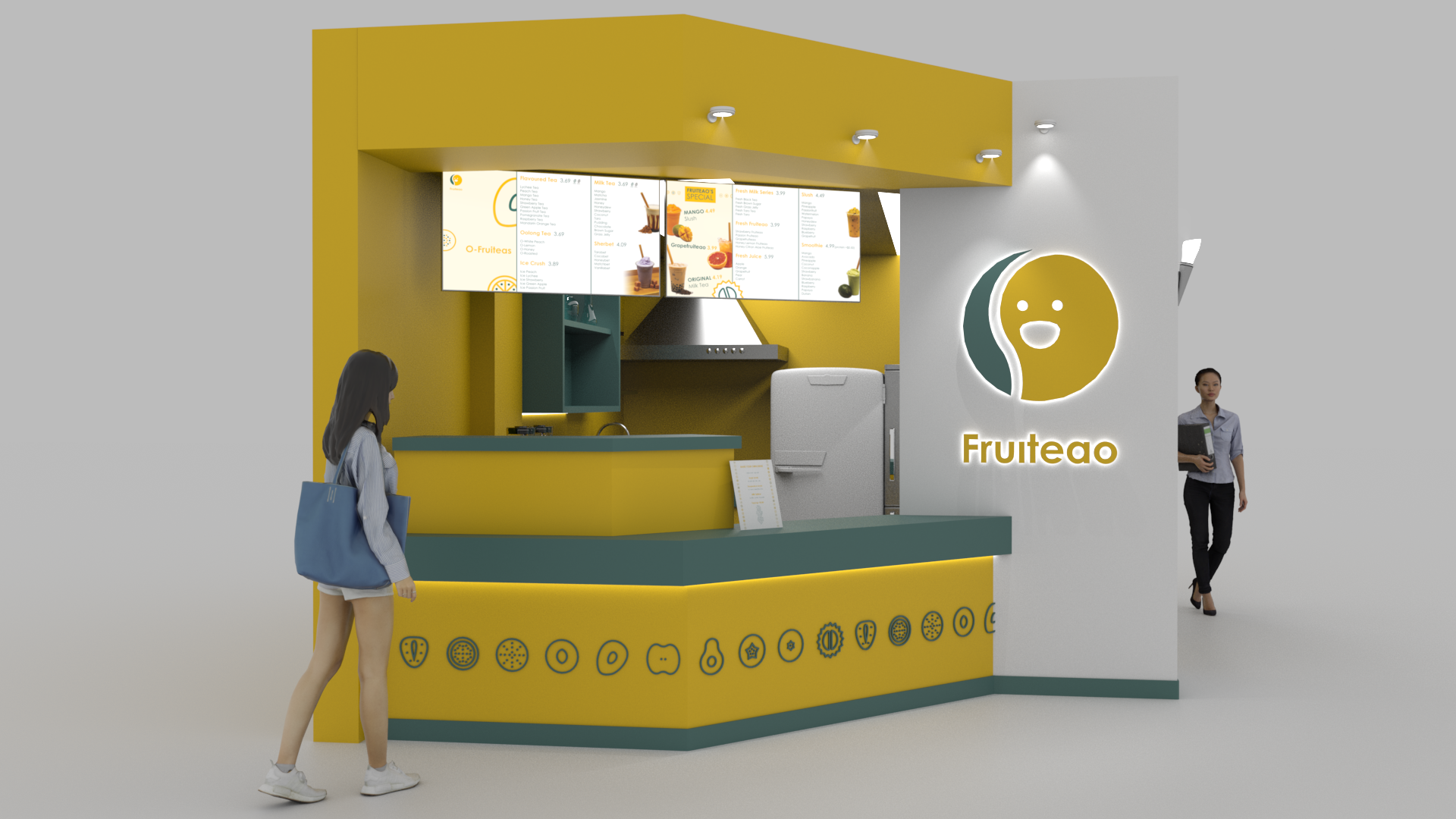
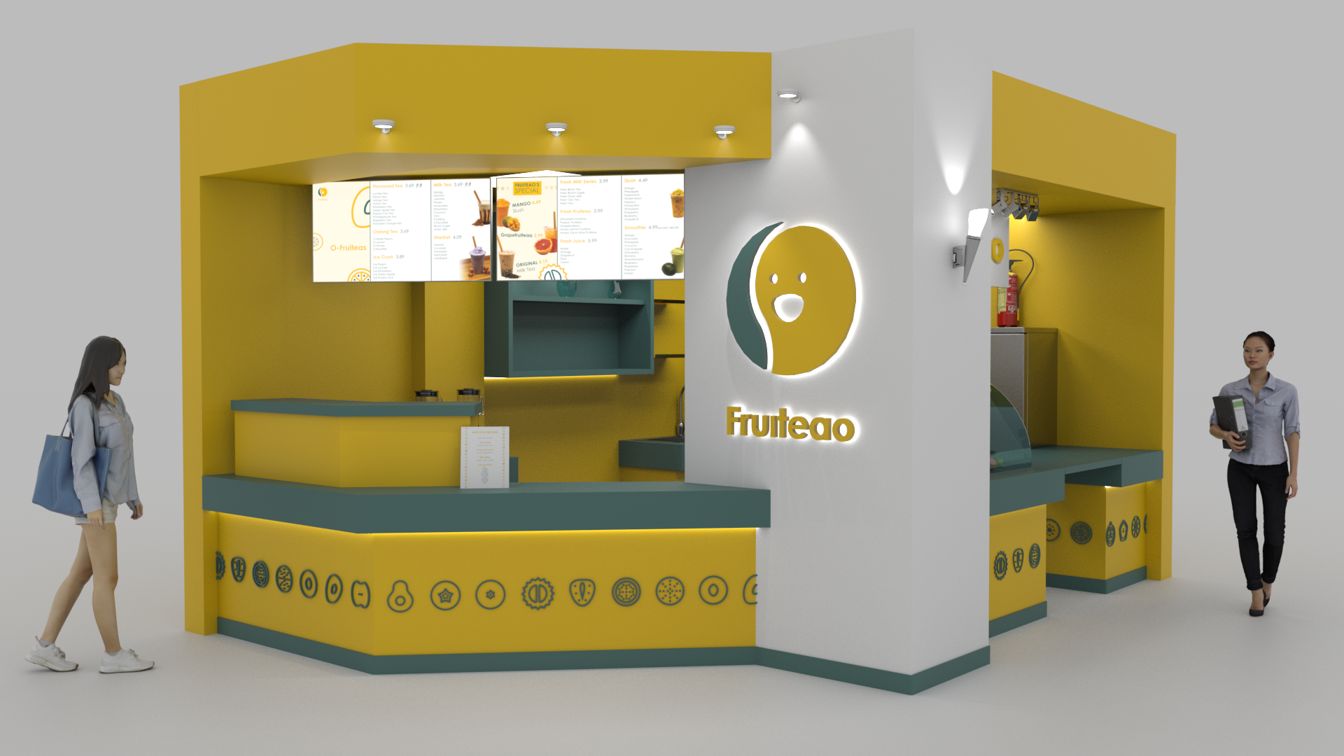
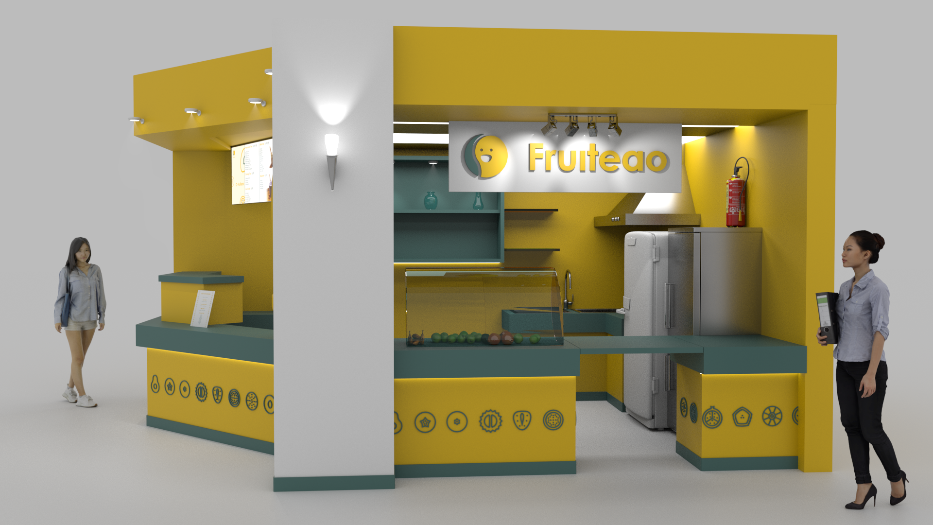
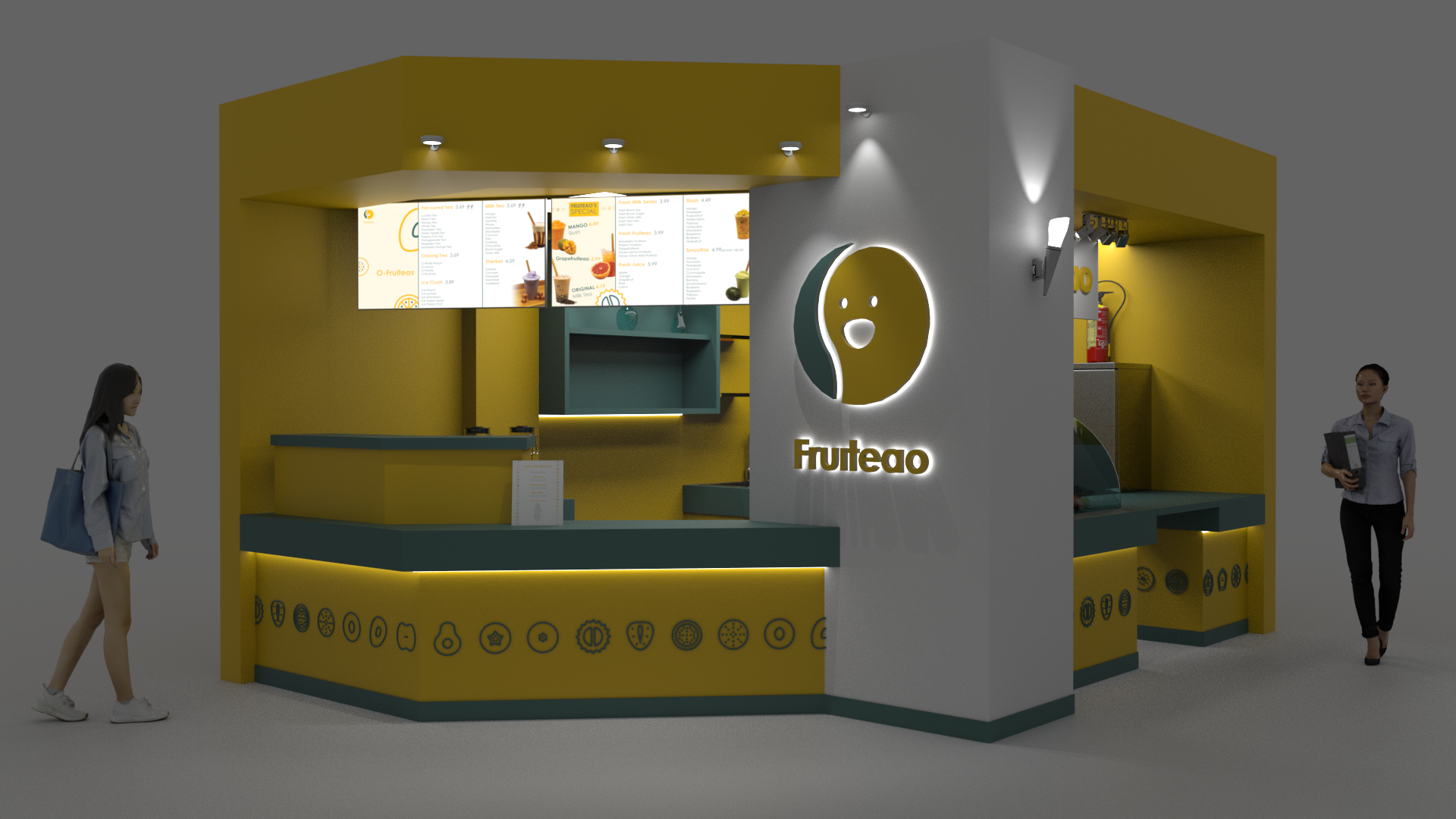
The "Fruiteao" logo was created for a bubble tea shop specializing in fruit-infused drinks. The goal was to develop a brand identity that would immediately connect with the vibrant and fun atmosphere typical of bubble tea culture, while keeping the design simple, welcoming, and versatile for multiple applications.
Design Elements
Designing the Fruiteao logo involved thorough research into modern branding practices, as well as an understanding of the bubble tea market. The challenge was to create something both unique and instantly relatable, offering a visual language that is modern yet rooted in the core concepts of freshness and fun. The final product strikes the right balance between professional and playful, ensuring it resonates with the intended target audience.
The design also reflects my multidisciplinary approach, as I combined elements of graphic design, brand strategy, and playful illustration techniques. The logo’s simplicity belies the detailed thought process behind every choice—from the balance of the colors to the positioning of the smile. Every element serves the purpose of representing the client’s vision in a way that is not only functional but also visually compelling.
Application in Portfolio
For my portfolio, this logo design exemplifies my ability to distill a brand’s essence into a clean, visually appealing design. It highlights my skills in creating cohesive brand identities through a thoughtful selection of color, typography, and iconography. The "Fruiteao" project showcases the versatility of my design work, particularly in creating logos that are adaptable across various media platforms, ensuring a consistent and impactful brand presence.
Client: Fruiteao
With: Hierarchy Design Studio
Location: 113 McCaul St, Toronto, ON M5T 2X3
The "Fruiteao" logo was created for a bubble tea shop specializing in fruit-infused drinks. The goal was to develop a brand identity that would immediately connect with the vibrant and fun atmosphere typical of bubble tea culture, while keeping the design simple, welcoming, and versatile for multiple applications.
Design Elements
- Color Choices
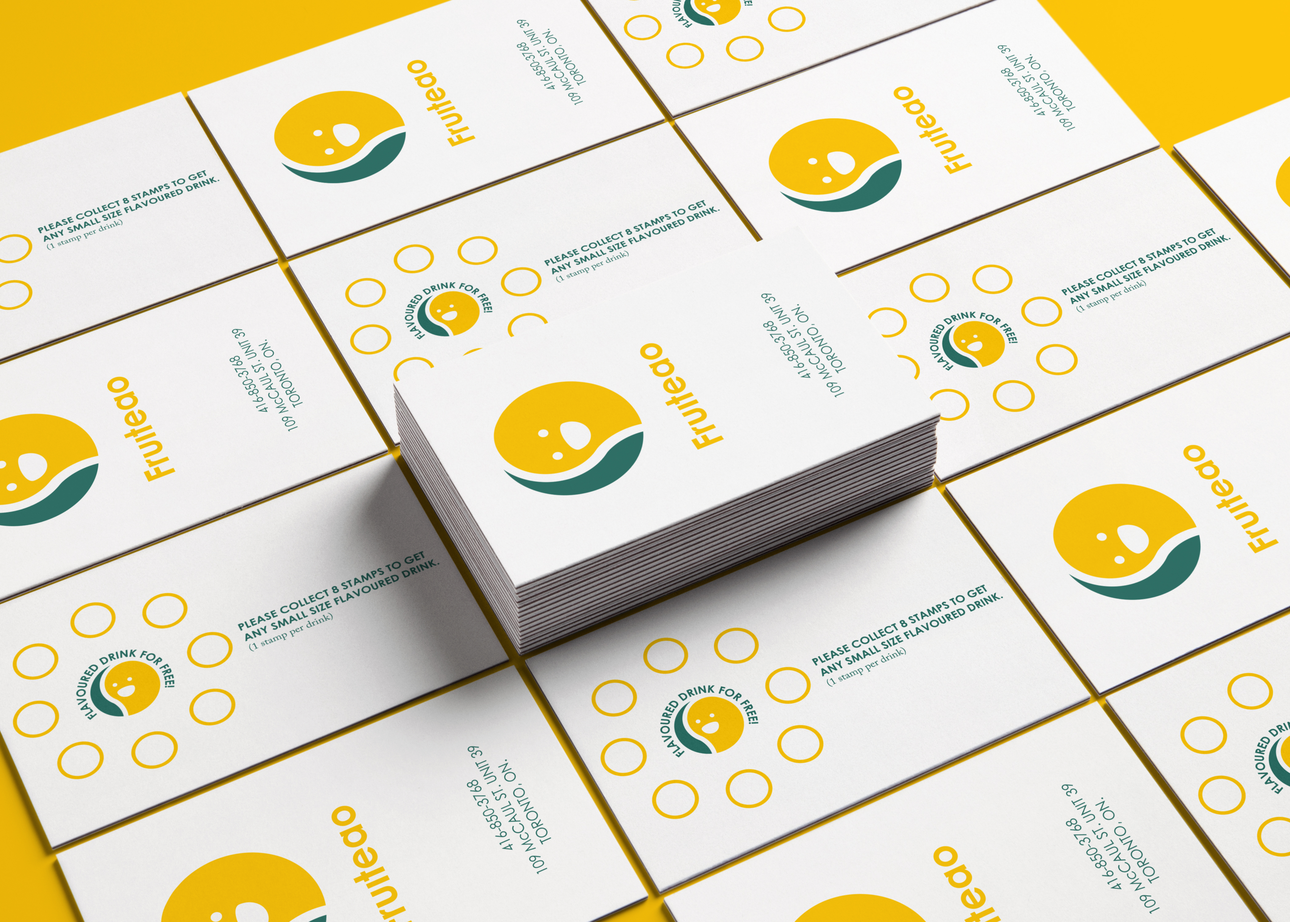
The color palette plays a crucial role in conveying the brand’s freshness and vibrancy. The bright yellow used in the logo evokes a sense of warmth and joy, perfectly symbolizing the fruit aspect of the brand. Yellow, often associated with energy and happiness, enhances the playful nature of the logo. The deeper, darker color used in contrast helps ground the design, offering a striking yet balanced visual identity that stands out. The combination of bright and dark colors allows the logo to be versatile in a variety of settings and applications, from packaging to signage. - Typography
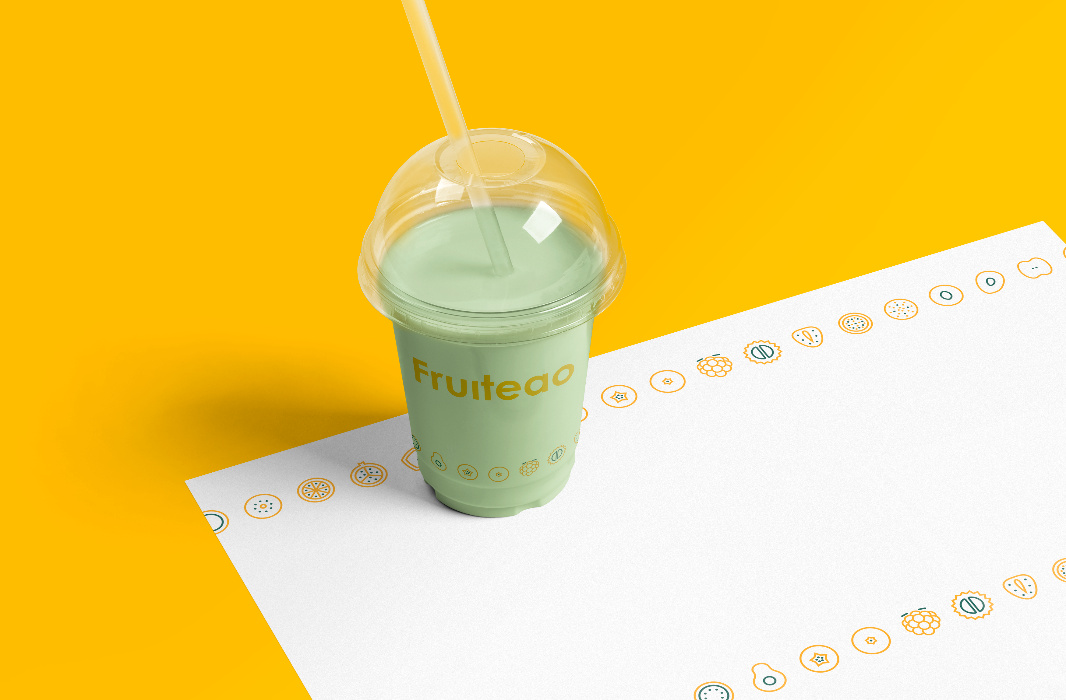
The typography of "Fruiteao" utilizes a bold, rounded font, contributing to the logo’s approachable and friendly tone. This choice of font aligns with the intended atmosphere of the bubble tea shop—a fun and lively space where customers can relax and enjoy their drinks. The smooth, rounded letterforms mirror the visual experience of drinking bubble tea, with its soft, circular bubbles. - Iconography
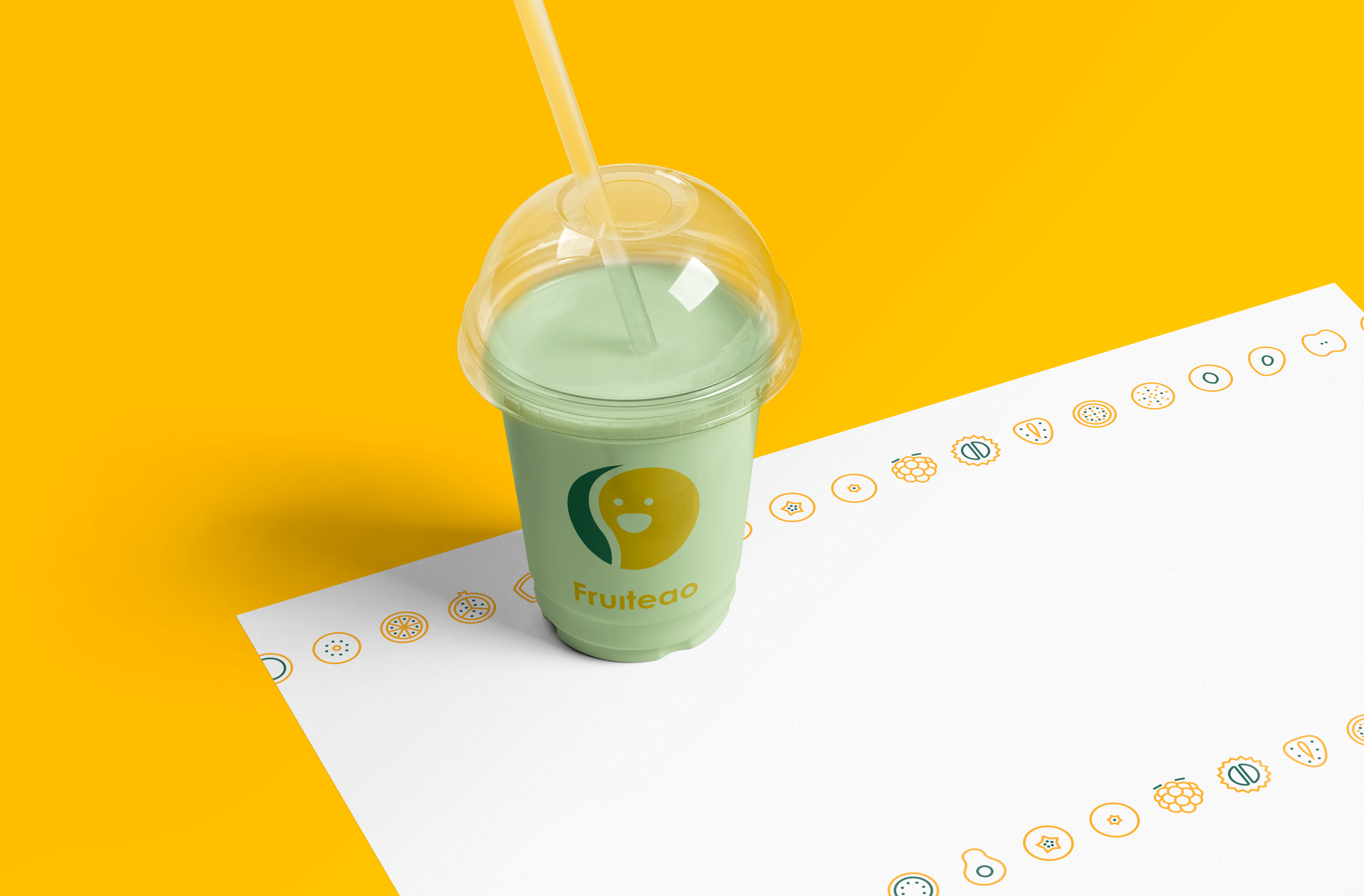
The smiling face within the logo is a key feature, adding a friendly and inviting touch to the overall design. The icon can be interpreted as both a fruit slice and a tea bubble, subtly connecting the brand name to the product in a visually appealing manner. The character-like representation gives the brand a fun personality, reinforcing a positive association with the shop and making it memorable for customers. The simplistic yet expressive design ensures that the logo remains clean and adaptable across different mediums. - Simplicity and Versatility
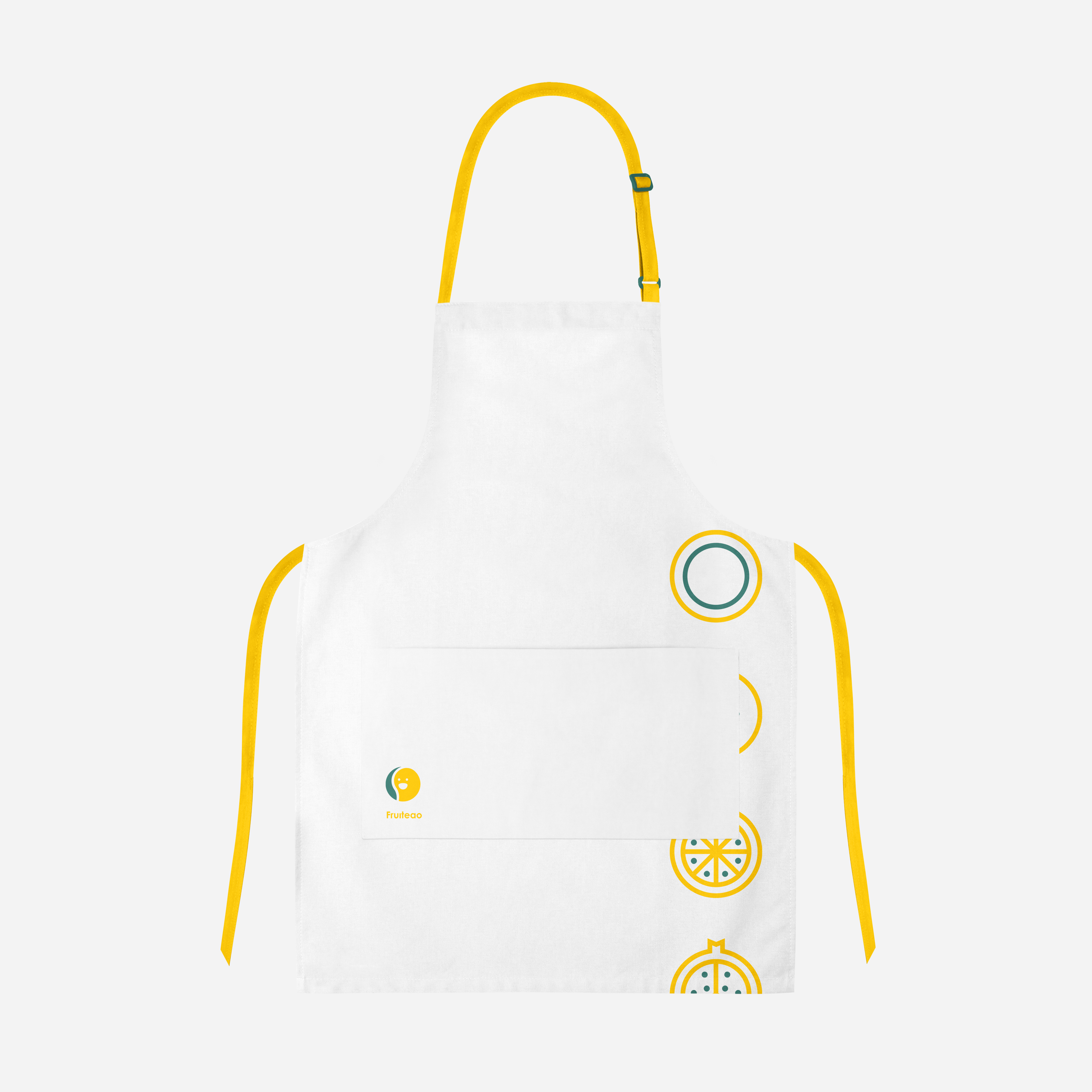
The simplicity of the Fruiteao logo ensures its versatility across various platforms. Whether used on digital media, product packaging, store signage, or marketing materials, the design remains impactful without being overcomplicated. This flexibility is essential for branding in today’s diverse media landscape. The clean, minimalistic approach also guarantees that the logo will be easily recognizable at small scales, such as on social media or as a product icon.
Designing the Fruiteao logo involved thorough research into modern branding practices, as well as an understanding of the bubble tea market. The challenge was to create something both unique and instantly relatable, offering a visual language that is modern yet rooted in the core concepts of freshness and fun. The final product strikes the right balance between professional and playful, ensuring it resonates with the intended target audience.
The design also reflects my multidisciplinary approach, as I combined elements of graphic design, brand strategy, and playful illustration techniques. The logo’s simplicity belies the detailed thought process behind every choice—from the balance of the colors to the positioning of the smile. Every element serves the purpose of representing the client’s vision in a way that is not only functional but also visually compelling.
Application in Portfolio
For my portfolio, this logo design exemplifies my ability to distill a brand’s essence into a clean, visually appealing design. It highlights my skills in creating cohesive brand identities through a thoughtful selection of color, typography, and iconography. The "Fruiteao" project showcases the versatility of my design work, particularly in creating logos that are adaptable across various media platforms, ensuring a consistent and impactful brand presence.
